


A mobile app for ordering healthy and Ready-to-Eat meals by an American brand for health-conscious people in India.


About QuickFit
-
QuickFit is an American company that provides Ready-to-Heat food.
-
It’s 100% organic, preservatives free, and contains no artificial flavoring.
-
The food is cooked by the world’s top chefs which makes it extremely tasty, healthy, and perfect for fitness enthusiasts.
How might we
localize QuickFit's global offerings?
The
Challenge
given by the business
Primary Goal
To build a platform tailored for the Indian audience where they could order QuickFit's Ready-to-Heat meals.
Secondary Goal
To educate and spread awareness on leading a healthy lifestyle to the users.
The
Solution
Based on our research (shown below), we defined our target audience as people who were fitness freaks, diet-conscious, and willing to pay a premium.
I decided to design a mobile app by keeping in mind market opportunities, target audiences - mental model, dietary preferences, lifestyle, and awareness.
Before getting into the design process, here are the key features.
Why QuickFit
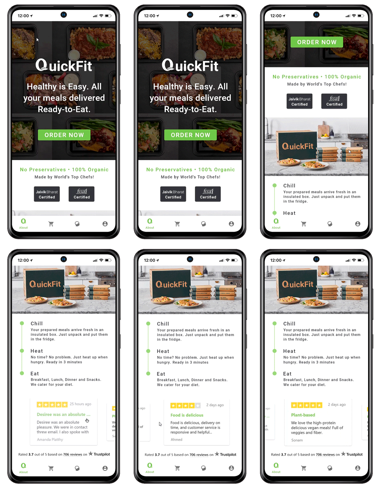
Build awareness and trust on QuickFit’s ready-to-heat food which is 100% organic, preservative-free, contains no artificial flavouring cooked by world’s top chefs.
Mind - Body - Diet
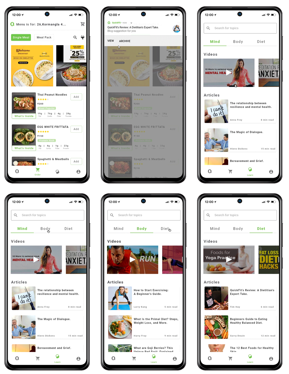
Educate the users on healthy lifestyle through videos and articles published in collaboration with renowned doctors worldwide.
Single Meal & Meal Pack
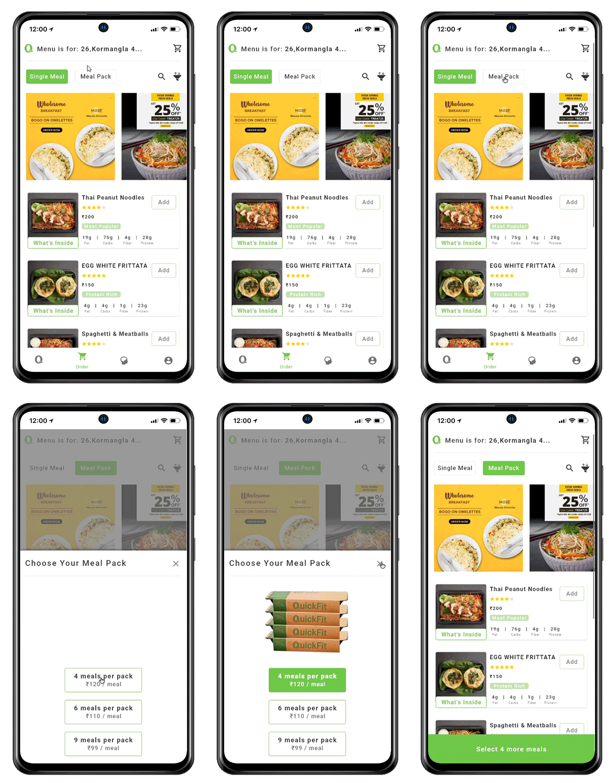
Localized offering of by adding option of ordering a single meal so that users can try and order when they feel the need.
What's Inside
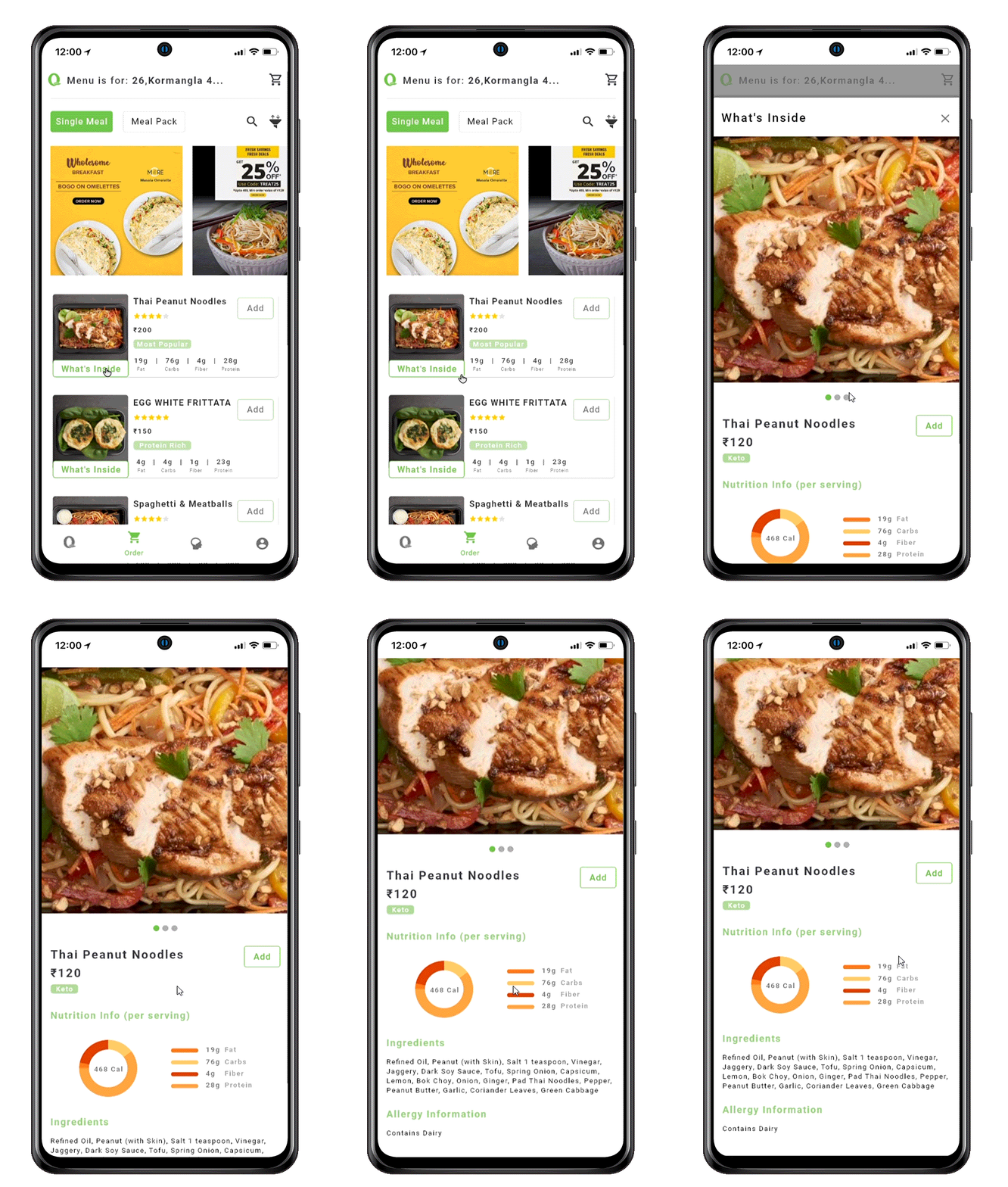
Get to know more about the meal - nutritional information, ingredients, allergy information and serving size etc.
Dietary Preference
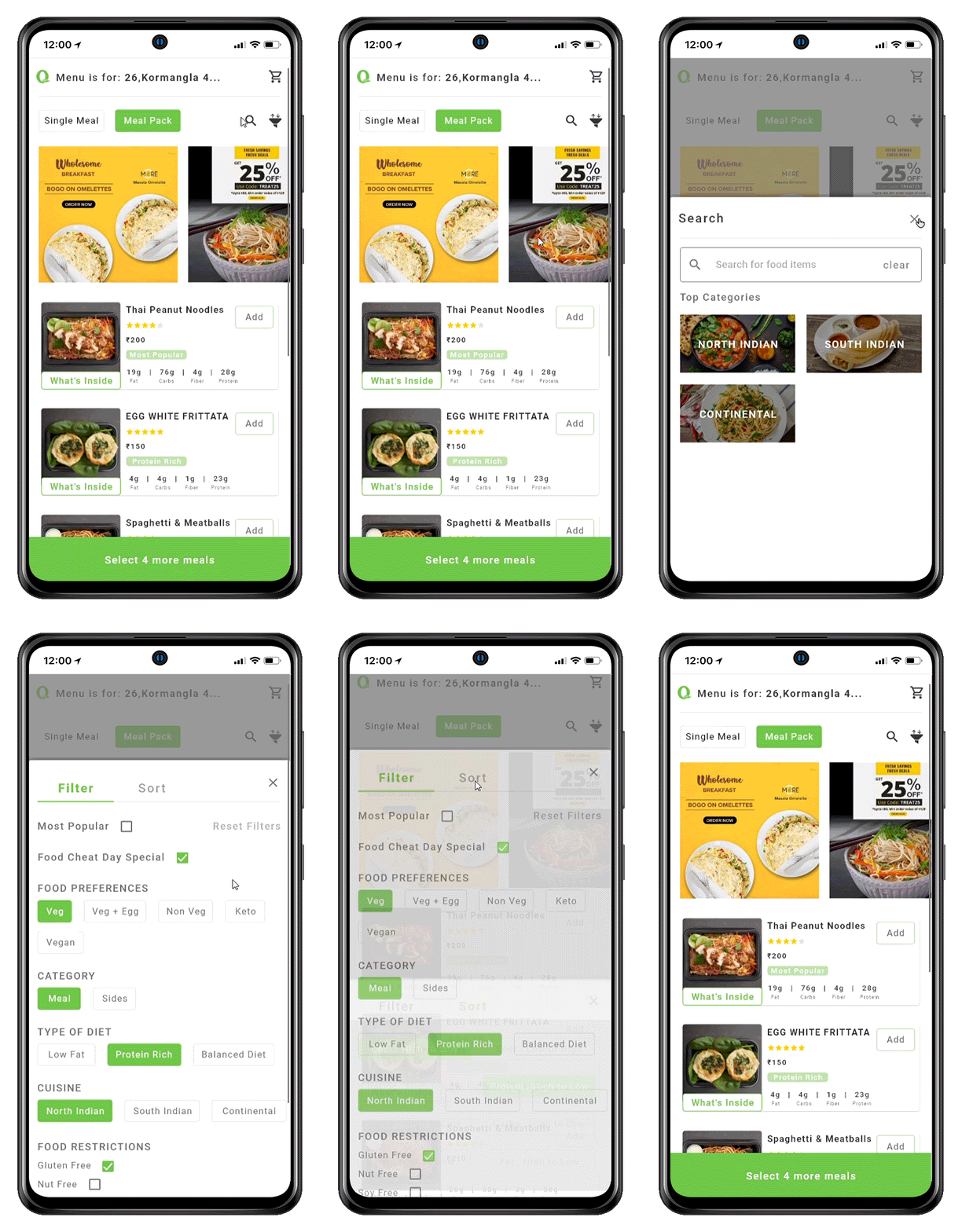
Users can save their dietary preference which will help them in placing orders in future.
Onboarding
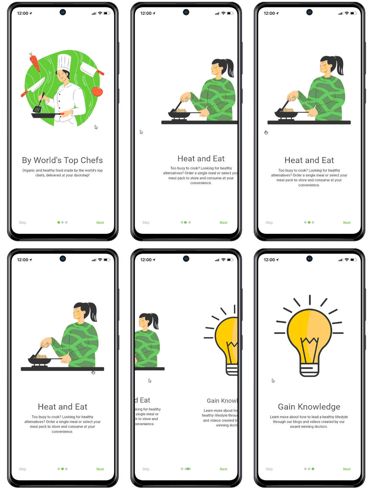
The 3 onboarding screens give an overview of QuickFit's offerings to its first-time users.
Let's dive into the process now.
My Role: UX Design & Research
My Process

Empathize
Preliminary Research
Why-
To collect relevant data already available online.
How-
Used Facebook Insights Tool & Statista.
Key Takeaways-
3rd highest revenue
in the world is generated by India, for online food ordering. That's why expanding to India is a good decision,
for QuickFit
Mobile
Application
The target platform is Mobile because 81% of Indian consumers use mobile apps for food ordering
Target Audience
Healthy food enthusiasts in the age group of 25-34, mainly in the IT, entertainment and sports industry

Business Strategy
To define our business strategy, we needed to know our target audience.
We got this information from the secondary research, so thought this would
be the right time to define the business strategy
Evolution of Target Audience and Location
Initial
-
target audience
-
upper middle class
-
higher strata of the society
-
fitness freaks
-
-
target location
-
Tier 1 Cities
-
Tie-Ups
Tie-Ups with local gyms, nutritionists, influencers, fitness instructors
taking personal classes, and dieticians.
Marketing
-
Focus on Marketing will be secondary because of more value given to word of mouth, especially since we are targeting Tier 1 cities
-
Later when we target Tier 2 and Tier 3 cities investment will be done in Paid Ads, Billboards
Future
-
target audience
-
someone who wants to eat healthy food and invest in their fitness, even if they are not that great financially
-
-
target location
-
Tier 2 and Tier 3 cities
-
Survey: Find out the target audience
Why-
To collect data related to - demographics, lifestyle, and know their view on such a product.
How-
This survey was sent out to 40 people who fit our target audience.
I kept a mixture of open-ended questions and MCQs.
Important Insights-
25%
people had some food restriction/allergy
88%
people were working
on their fitness
52%
people were okay with paying a premium
78%
people had a positive reaction to the concept
Interviews: Find user needs
Why-
To know more about their daily lifestyle, why & when they ordered food, more about their thoughts on the concept.
How-
From the 40 people I surveyed, I selected 5 based on specific criteria-
1) Ordering food saved their time
2) Were working on their fitness
3) Order food online
I interviewed them on a Zoom call.
Important Quotes from Interviews-

How do I trust that the meals are 100% organic, preservatives free and have no artificial flavouring.
Insight:
People don't really trust brands
I don't plan my meals a week in advance, I always order on the go. Either based on my craving or my hunger.
Insight:
People order on the go
While ordering food, taste matters a lot for me. Food should be both healthy and tasty.
Insight:
Taste matters a lot
I want to lose weight and eat right. But I don't know how to select the right meals due to a lack of knowledge.
Insight:
Lack knowledge about food
Task Analysis with competitor's app
Why-
To understand the mental model of Indian users,
I conducted a cognitive task analysis.
It helped me structure the app in such a way that it is intuitive and effortless.
How-
I downloaded a competitor's app and shared the screen on the video call.
The users were given a task to place an order and were asked to think out loud during the exercise.
Key Findings-
1
Users frequently read the FAQ to understand more about QuickFit's offerings.
2
Users looked for information like reviews, ratings, etc. So they could trust QuickFit.
3
Users did not favour the subscription method.
4
Users got confused with terms and icons not popular in India.
5
The application was not intuitive, it was confusing.
6
Users did not like having to sign up before even viewing the meals.
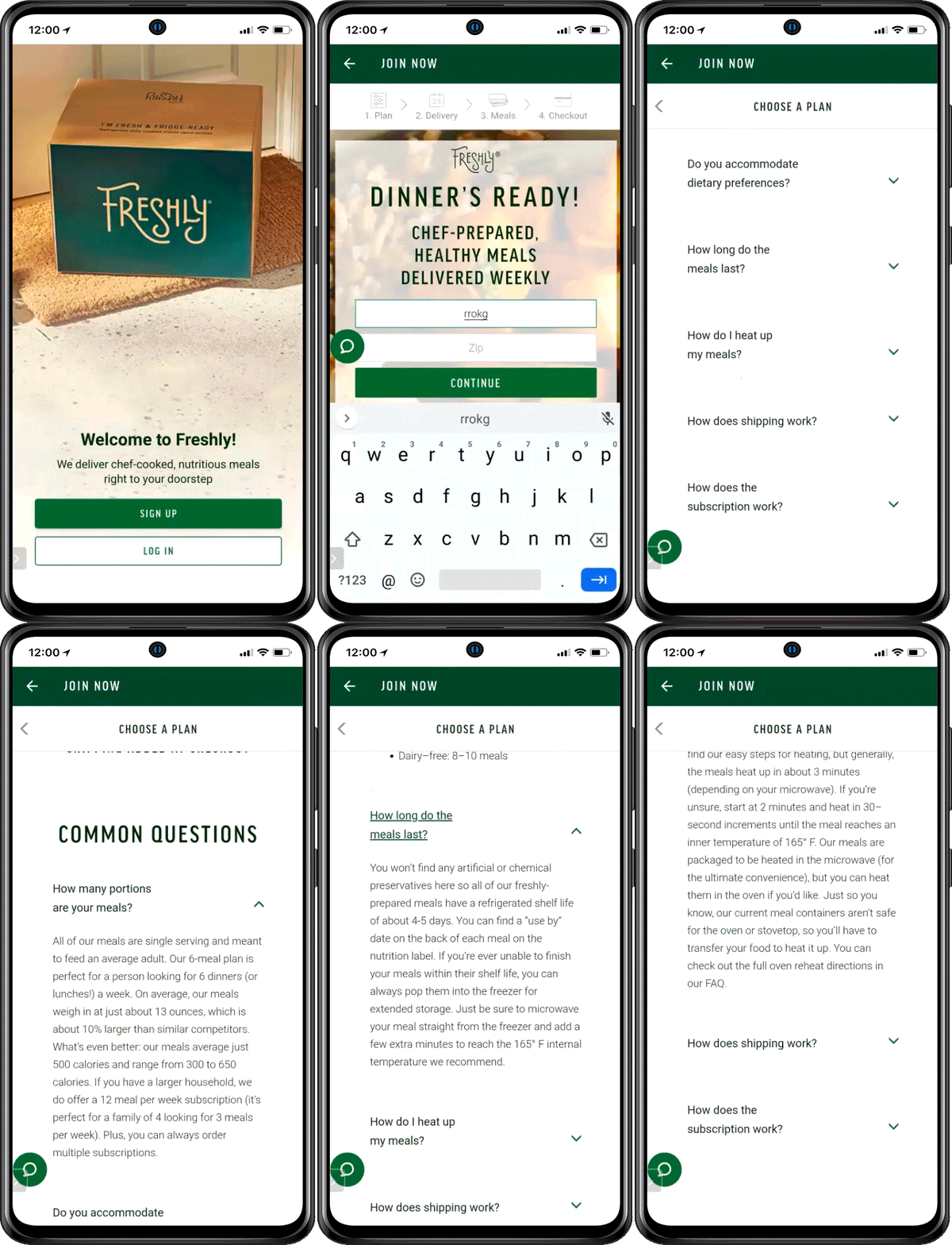
Actual screen recording of a cognitive task
Define
User Persona
User personas were created based on my research.
These personas are a trimmed down version of the actual personas.

Foodie
Rhea (25 yrs)
Java Developers, Epicure & Cook
Rhea stays fit by cycling but she is an Epicure. She likes to eat healthily but gives more preference to taste. She does not have to cook or order online as she has hired a cook. Whenever she craves specific food items, she orders online.
"I wish I could have the food items I crave for, available instantly."
.png)
Healthy Food Lover
Ishaan (36 yrs)
UX Strategist, Healthy food lover
He loves south Indian food and orders regularly from a specific restaurant he trusts. He orders all meals - breakfast, lunch, and dinner. He feels that the world needs healthier food options to order from.
"There are many brands that provide healthy food. But they are not reliable. Their taste, quantity and quality are also not good."
.png)
Bodybuilder
Sahil (27 yrs)
Data Scientist, Bodybuilder & Foodie
In spite of his hectic schedule, he takes out time to workout. He is a big foodie so likes to cheat occasionally. Otherwise, he follows a strict diet.
He usually orders from Zomato and Swiggy.
"I wish I could see the exact amount of macro-nutrients when I order food. Because I follow a diet"
Journey Maps
Journey maps were created based on the user's journey during cognitive task analysis.
This journey map is a summary of the 3 journey maps created for each persona.

Ideate
User Needs: from competitive analysis
Based on the competitive analysis, 33 important features were selected.
Then based on the user journey, the most important ones were selected (in green).


Competitive Analysis
Brainstorming & Priority Matrix
To make the app Unique, we brainstormed several ideas.
Brainstorming

Then selected the ones which were most important, using a priority matrix.
Priority Matrix

Information Architecture
This is a small version of the Full IA I had created.
This acted as a backbone for me while designing the UI of the App.

User Flows
Once my IA was ready, I identified 3 user flows -
-
Ordering Single Meal
-
Ordering Meal Pack
-
Exploring the App.
User Flow 1-
Ordering Single Meal:
-
Onboarding Screens
-
About
-
Order
-
Set Delivery Location
-
Search
-
Filter
-
Sort
-
What’s Inside
-
Cart
-
Schedule Delivery
-
View / Apply Coupons
-
Push Notifications
User Flow 2 -
Ordering Meal Pack:
-
Onboarding Screen
-
About
-
Order
-
Set Delivery Location
-
Search
-
Filter
-
Sort
-
Meal Pack Selection
-
Number of meals left (message)
-
What’s Inside
-
Cart
-
Schedule Delivery
-
View/Apply Coupons
-
Push Notifications
User Flow 3 -
Exploring the App:
-
Onboarding Screen
-
About
-
Order
-
Set Delivery Location
-
Filter
-
Number of meals left (message)
-
Push Notifications
Identifying these user flows helped me analyze the user's movement through the app and improve it further.
Prototype
Wireframes & Prototyping
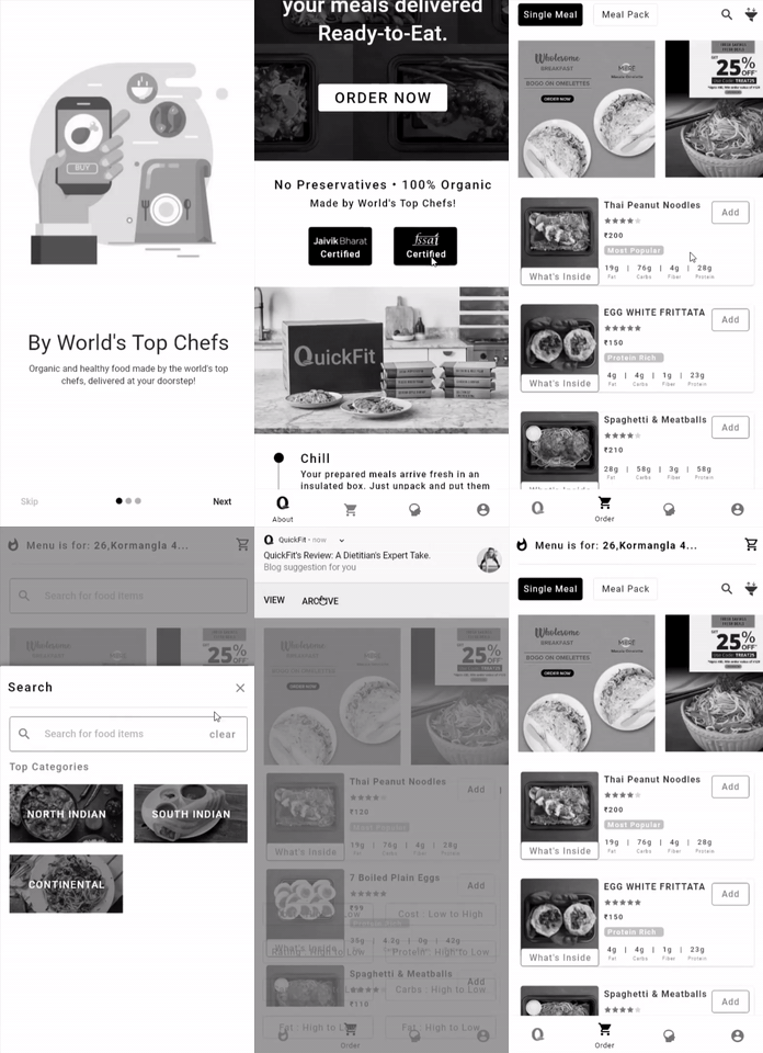
I created greyscale wireframes so that while designing I could create a good hierarchy and structure before adding colors to the design.

Test
Usability Testing
I only had time to do usability testing with 3 people due to time constraints.
I conducted these usability tests on zoom call, for which I used greyscale prototypes.
Actual GIF of a usability test conducted.
User Feedback :
-
Adding sort options for carbs, fats
-
Found the flow easy to use and intuitive
-
Found the concept better than anything else
-
Thought the price was a little high
Prototype
Colors, Typeface and Icons


Final UI
Onboarding Screens
These are the onboarding screens that appear as soon as the QuickFit application launches. They tell the user about QuickFit's app.
There are 3 aspects we cover-
1) Food is made by the world's top chefs
2) Heat & Eat food which gives an option of ordering both single meals and a meal pack
3) Gain Knowledge, you get to learn about leading a healthy lifestyle. There are 3 sections - Mind, Body & Diet.
Why QuickFit
The About icon in the bottom navigation takes you to a screen that shows USPs(No preservatives, 100% organic and made my world's top chefs) and credible information like - Licenses, Ratings, Reviews.
Single Meal & Meal Pack
Users can switch between the Single Meal or Meal Pack option. If the meal pack is selected, users then have to select the number of meals the pack consists of, from the menu.
Dietary Preference
Users can save their filters and sort options as per their fitness goals for re-use. Filters to select Cheat day meals, Most Popular, Food-preferences, Category, Type of Diet, Type of cuisine, Dietary restrictions.
What's Inside
Every meal on the menu has a "What's Inside" option just under the image in the menu item. It gives more information about the meal like - larger images, nutrition info, ingredients and allergy info.
Mind - Body - Diet
Users will be notified about any new article/video which will take them to the Learn section. They can also educate themselves by going to the learn section manually through the bottom navigation.
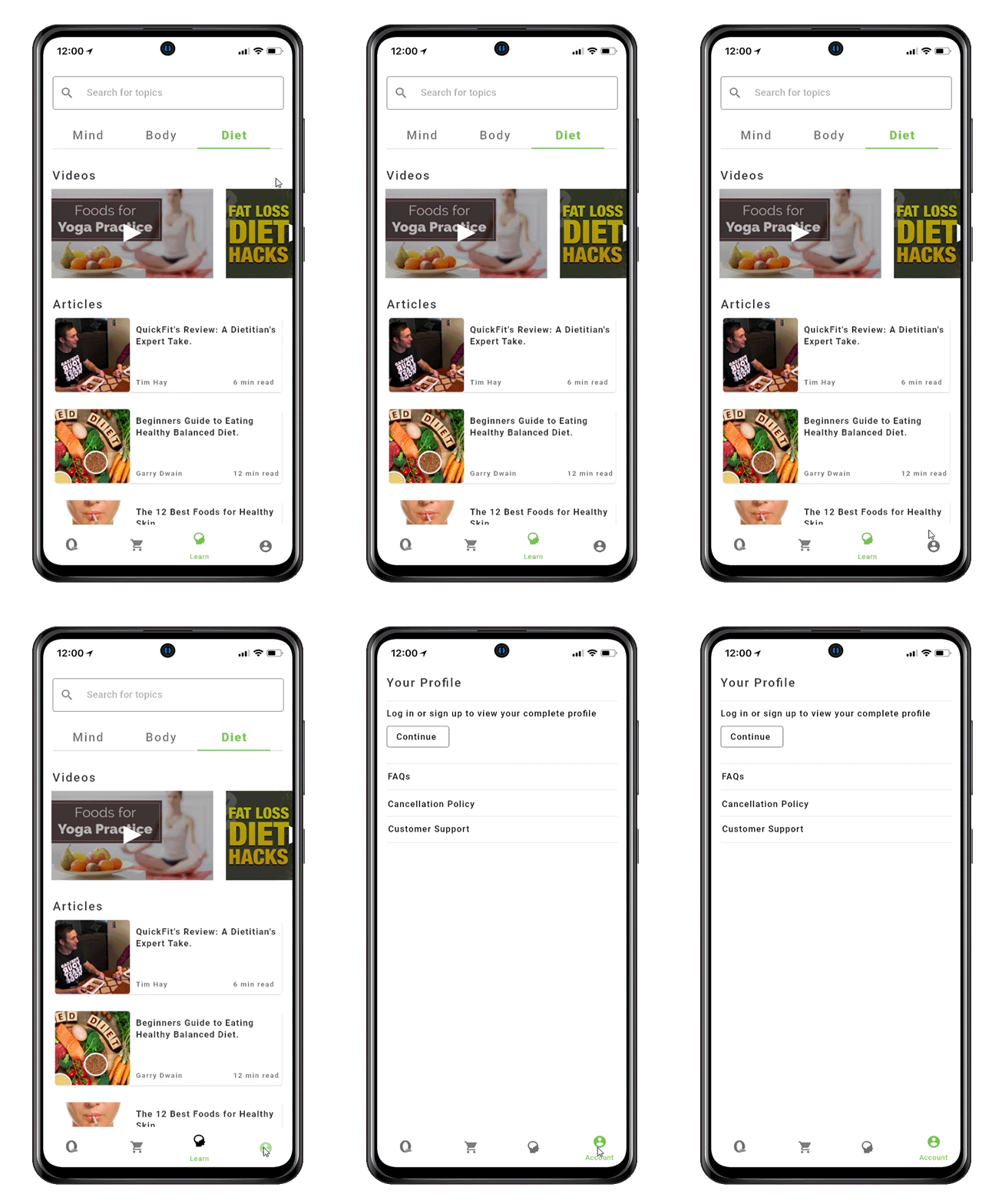
Account
Users can order food without having to create an account. So even if users are not logged in, we decided to provide them with access to important information like -FAQs, Cancellation policy and Customer Support.
Looking back
at what I learned and achieved
CONCLUSION
Results and impact:
As compared to the experience my users had during the cognitive tasks, their experience during usability testing with the new design was very good! My users found it intuitive to navigate. Fitness enthusiasts often have a diet to follow and the my users said that this app allows them to choose food as per their diet which is great because no other existing app in India offers that.
Main challenge and lessons learnt:
I did this project along with my full time job and since it was time bound too it was a little tedious at times. I did a lot of things for the first time in this project, like user interviews,, cognitive tasks, making a detailed IA beforehand, designing the UI, prototyping and doing usability testing. Learning on the go and delivering was a challenge, but I got to learn a lot in less time, it was a fantastic experience!
Next steps:
I need to complete a few more user flows and prior to which I will test with more users, make changes based on their feedback and add micro-interactions to the final design.